Homepage

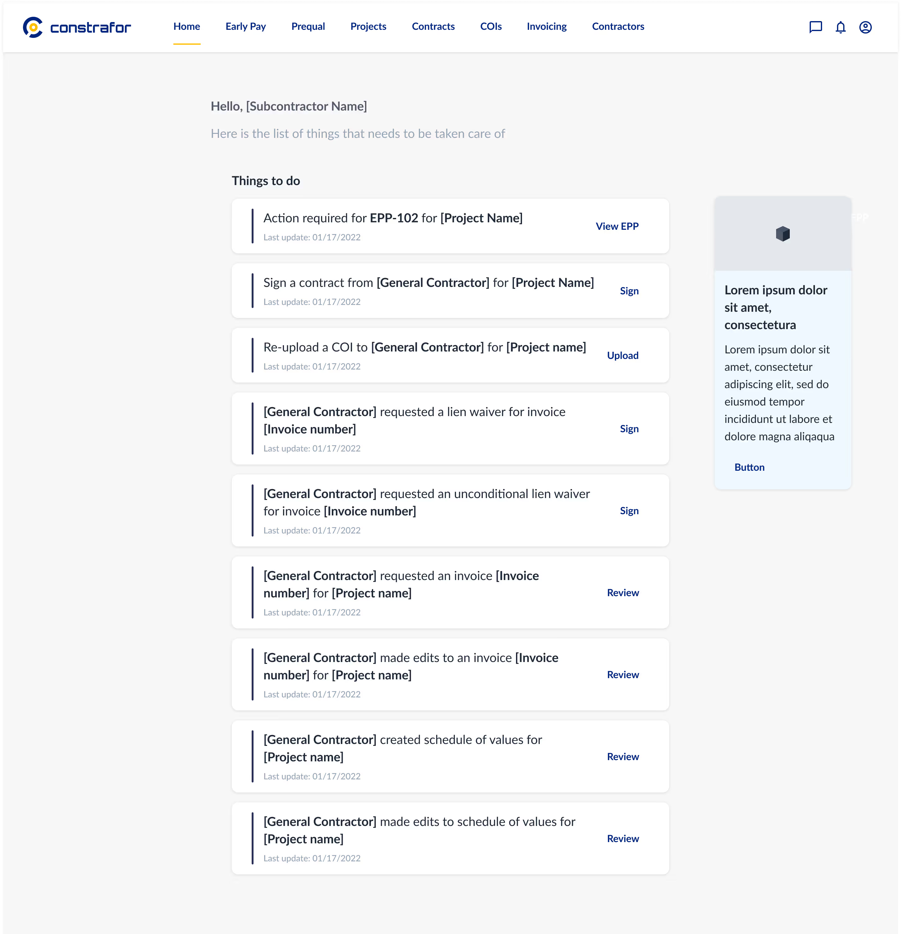
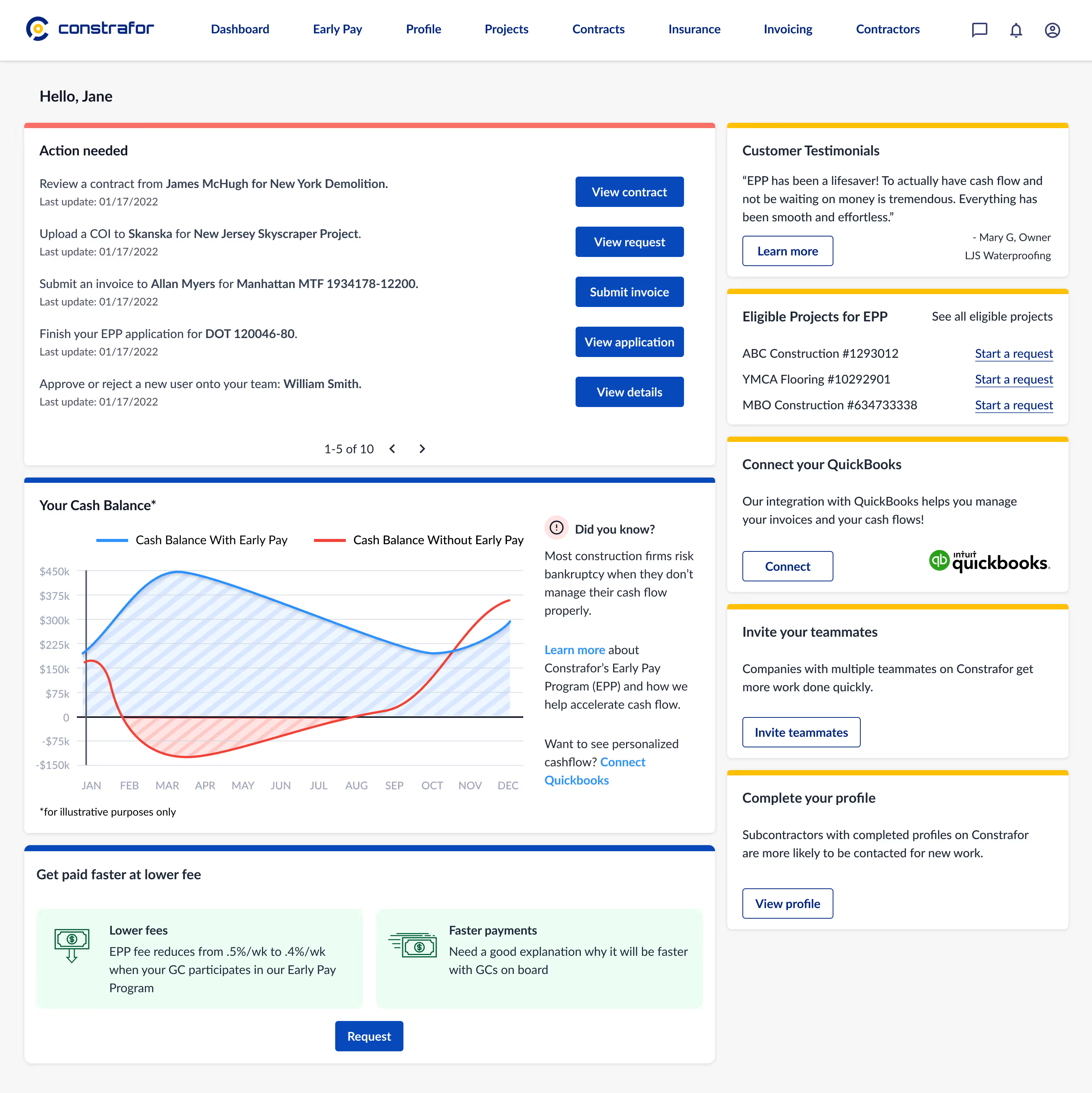
In this case study, the imperative to simplify task navigation for subcontractors within a construction project became evident through the challenges posed by an intricate and cluttered homepage design. Subcontractors faced difficulties deciphering and executing tasks efficiently, resulting in project delays and diminished productivity. The outdated interface, characterized by convoluted menu structures, prompted a redesign initiative aimed at enhancing user experience and facilitating smoother interactions between subcontractors and General Contractors (GCs).
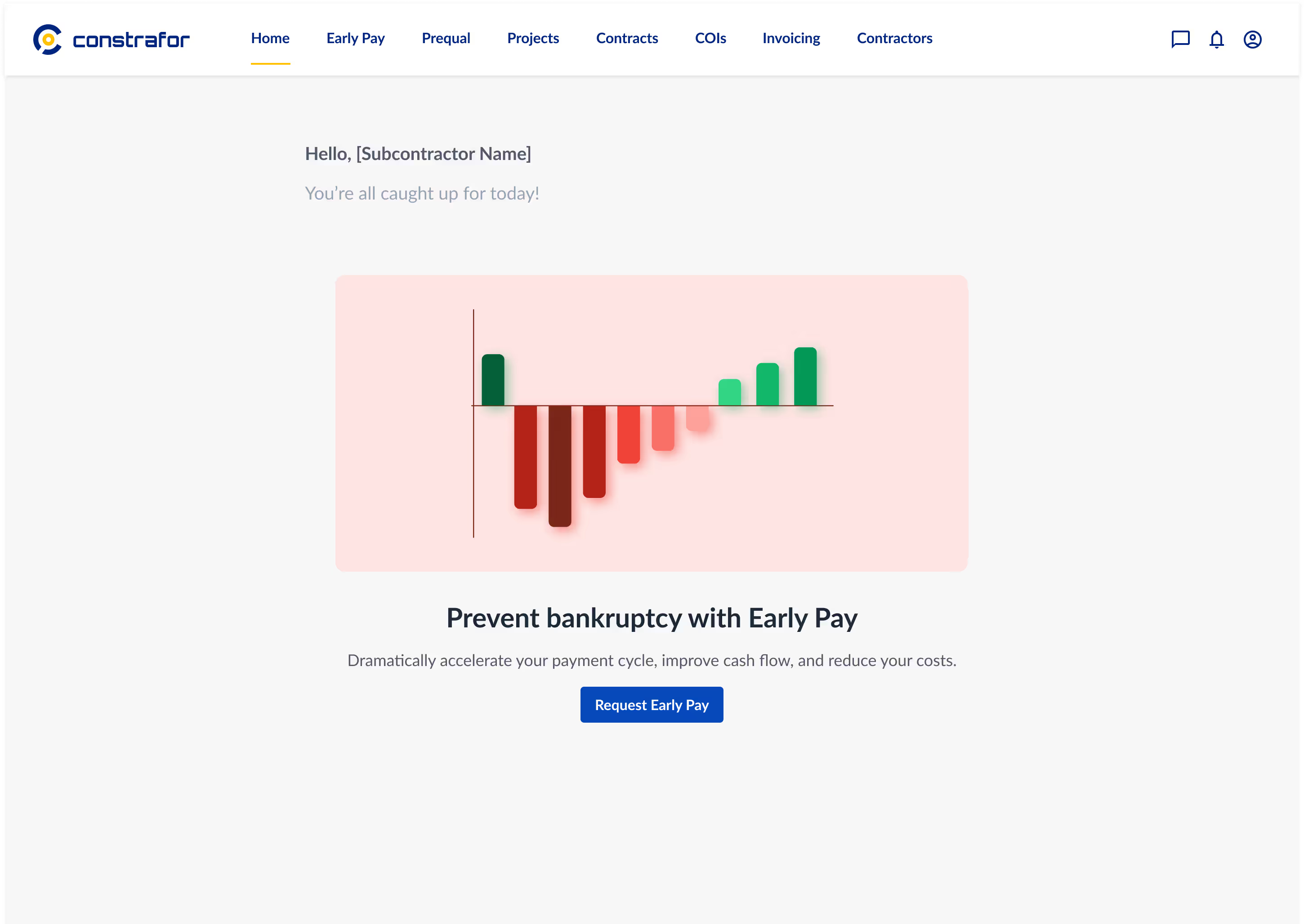
The revamped homepage design yielded substantial improvements, particularly in the realm of subcontractor-GC collaboration. With strategically placed buttons, a simplified menu hierarchy, and visually intuitive elements, the redesigned interface facilitated a more seamless navigation experience. Subcontractors reported a significant reduction in the time required to locate and complete tasks, highlighting the tangible impact of the redesign on their workflow efficiency. Through this case study, it becomes evident that a user-centric approach to homepage design not only addresses the specific challenges faced by subcontractors but also fosters enhanced communication and collaboration dynamics within the construction project ecosystem.

Want to get in touch?
Drop me a line!

Lorem ipsum dolor sit amet, consectetur adipiscing elit.

Thank you! Your submission has been received!
Oops! Something went wrong while submitting the form.